
The Eyes That Remain
This painting depicts a young boy from a Sudanese refugee camp. I painted this piece years ago, yet his presence has never left me. Even now, it is his eyes that remain—steady, searching, and deeply human.
When I worked on this portrait, I was drawn immediately to his gaze. It carried a weight far beyond his age, a quiet testimony to experiences that did not need words. His eyes do not ask for sympathy, nor do they explain themselves. They simply exist, holding memory, loss, and resilience all at once.
I used a traditional oil technique to give the portrait a timeless quality. Warm earth tones shape his face, while cooler blues and muted reds surround him, creating a subtle tension between tenderness and hardship. The brushstrokes are expressive but restrained, allowing the texture of the paint to support the realism rather than overpower it. Light falls gently across his face, always leading back to the eyes—the emotional center of the work.
I chose not to place him in a specific setting. There is no visible camp, no defined background. I wanted the focus to remain on the child himself, not on the circumstances imposed upon him. In this way, he becomes more than a single subject; he becomes a reflection of many unseen lives.
Years have passed since I painted this work, but the boy’s gaze still confronts me. His eyes remain unchanged, reminding me that behind every label—refugee, displaced, statistic—there is a person, a story, and a presence that endures long after the moment is gone.Celebrating an Award-Winning Vision: The Story Behind "Blue Green Eyes"

Winning first prize for abstract portrait composition in 2020 was a defining moment for my artistic journey. This specific piece, titled ”Blue Green Eyes,” was later chosen to grace the very first cover of Expressions Magazine in June 2022, representing a milestone for both the publication and my own work.
The painting is a deep exploration of how we perceive the human face through the lens of abstraction. While the eyes are rendered with sharp, realistic detail to anchor the viewer, the rest of the portrait begins to dissolve into a series of bold, vertical brushstrokes and textured layers. This technique allows the subject to feel as though they are emerging from a dreamlike environment, blending the boundaries between the person and the paint.
The color story is built on a deliberate contrast. By using cool, atmospheric teals and turquoises in the background, the warm ochre and peach tones of the skin become incredibly vibrant. This balance was key to creating the visual impact necessary for a magazine cover. Looking back at this 2020 win, I am reminded that art is a constant dialogue between what we see clearly and what we choose to leave to the imaginationmattis, pulvinar dapibus leo.
The Pulse of Essaouira:
A Market in Motion


When I painted these two pieces of the market in Essaouira, Morocco, a few years ago, I chose to work with acrylics to capture the raw and immediate energy of the medina. I wanted to move away from a traditional representation and instead lean into an abstract color harmony that reflects the sensory overload of the souks. By using vibrant colors and expressive textures, I sought to translate the movement of the crowds and the shifting coastal light into a painterly experience. I applied the acrylics with soft washes to create a sense of fluidity while maintaining thick, textured strokes to represent the solid architecture and the bustling stalls. The composition preserves the identity of the market through its suggested shapes and narrow alleyways, but the focus remains on the atmosphere—the heat, the noise, and the vibrant life of the city. I feel that this abstract approach across these two works better captures the spirit of Essaouira than a literal depiction ever could, allowing the viewer to feel the rhythm of the marketplace through the harmony of the paint itself.

Meet Hanna:
A Portrait from Addis Ababa
In my recent journey to Addis Ababa, I had the pleasure of meeting Hanna, who quickly became a very dear friend. This portrait is my way of capturing her spirit and the warmth of the connection we shared during my travels. Painted in acrylics on a large 100x100cm canvas, the scale of the piece allows for a deep exploration of color and emotion.
I chose to use a bold, expressive palette, layering vibrant blues against warm oranges and earthy tones to reflect the energy I felt in her presence. The thick, textured brushwork brings a physical life to the canvas, moving beyond a simple likeness to catch the light and movement of a fleeting moment. For me, this painting isn’t just a study of a face; it is a memory of a journey and a tribute to a friendship that stays with me even now that I am back home.


Kumla junkyard
I painted the Kumla Junkyard twice, capturing its assortment of waste. While many might see it as unpleasant or unsightly, I was inspired by the interplay of colors to bring it to life.
Both pieces, created with acrylic on canvas, measure 60×80 cm.
A Tapestry of Heritage: Celebrating Identity through Mixed Media
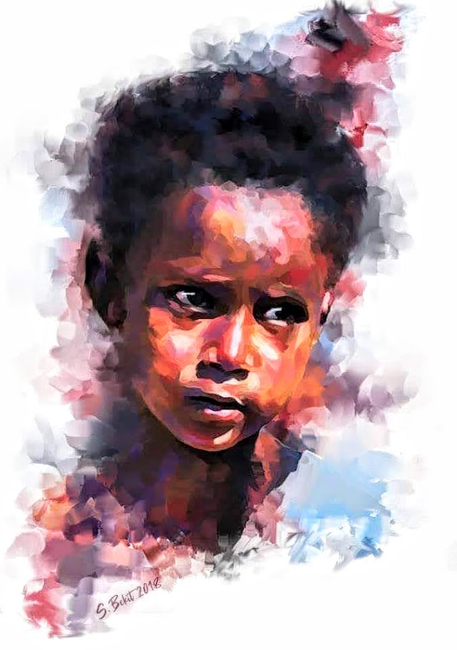
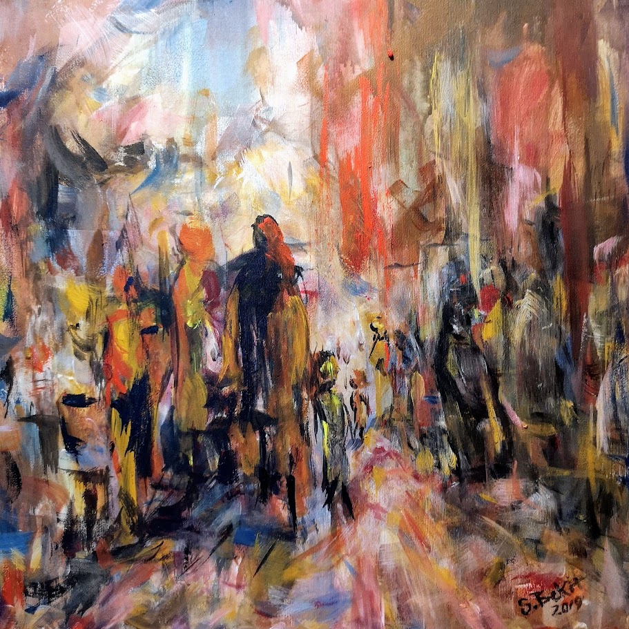
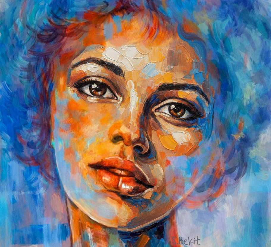
This collection is a vibrant celebration of identity and grace, born from a deep passion for painting folklore and tradition while drawing inspiration from the rich cultures of Ethiopia, Sudan, Eritrea, and Somalia. While rooted in realism, these works are rendered with an intense focus on texture and light through a sophisticated impasto technique. Bold, rhythmic brushstrokes build backgrounds that evoke the feel of weathered stone or hand-woven fabric.
The features are captured using deep, warm tones and precise detail, emphasizing the reflective glow of the skin and the intricate craftsmanship of traditional gold jewelry. These pieces explore the aesthetic harmony between the inner strength of the subjects and the delicate shimmer of their adornments. By blending these elements, the collection transforms classic portraiture into a compelling landscape of color, heritage, and light.


My First Experiment with Acrylic Pouring
My First Experiment with Acrylic PouringI painted this piece using an acrylic pour technique; I was testing the medium just to see the effect. It is impressive that this was a test of the medium, as the results show a great deal of control over the fluid’s behavior


Caricature samples
I have a deep appreciation for caricature art, particularly the political kind. I enjoy how these artworks exaggerate features and expressions to highlight the personalities, power dynamics, and even the flaws of political figures. The way they use humor and satire to comment on current events or political situations is something I find both thought-provoking and entertaining.
